


Scott Gehlbach writes:
You may recall my guest post back in late January on electoral manipulation in Russia’s parliamentary elections. You raised a good question in your comments that I am only now able to address.
In particular, you picked up on the statement in my post that “one might expect the distribution of precinct-level turnout to be approximately normal, to the extent that voters are making idiosyncratic decisions about whether to vote rather than do something else.” What I was trying to do was articulate a theoretical rationale for an empirical regularity posited by various Russian observers–to wit, that the distribution of turnout across precincts and so forth is “close to normal” in many other electoral contexts. In my haste to get something to Josh, however, I neglected to include evidence of the empirical regularity.
What does that evidence look like? I decided to start from scratch, assembling data at the precinct level or as close to it as possible for a number of countries–basically, whatever I could readily get my hands on. Here it is at the precinct level in Canada, Croatia, Armenia, and Sweden, with a normal distribution superimposed:
at the municipality level in Austria:
at the county level in the U.S.:
and at the constituency level in the UK and Mexico:
It is worth noting that some of these countries (e.g., the U.S.) have substantially more demographic sorting and targeting of campaign resources across space than does Russia.
The empirical distributions above generally look quite different from that in Russia’s parliamentary election last December, where the right tail is…um, heavy:
(Some of the observations with very high turnout are smallish precincts in institutions such as jails and hospitals, but that’s not the whole story: the average precinct in Chechnya, for example, reported 99.4% turnout.)
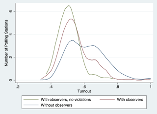
The following example is also interesting. Last December, the city of Moscow had a handful of independent election observers scattered across a few thousand precincts, with turnout in non-institutional precincts distributed as follows:
In contrast, the city was blanketed by election observers for the March presidential election, and the distribution of turnout was very different:
A similar story is told in a recent paper (no online version available) by Ruben Enikolopov, Vasily Korovkin, Maria Petrova, Konstantin Sonin, and Alexei Zakharov, who exploit the random assignment of election observers last December. The distribution of turnout is quite different–more like that in other countries–in precincts with observers:
Finally, it is striking that turnout last December does almost nothing to explain turnout this March–not what one would expect if turnout in both elections were driven, say, by demographic factors:
At any rate, I get the point about political behavior being driven by non-idiosyncratic factors, and I would not want to build a case for fraud on the distribution of turnout alone. But arguments by Russian observers about the distribution of turnout are one piece of the story, especially when juxtaposed against the distribution of turnout in elections presumed to be fair.
My response:
These graphs and discussion are extremely helpful, especially the contexts corresponding to the different Russian graphs. My only statistical comment is to recommend that Scott ditch the phrase “approximately normal” and just refer more generally to the distribution of average votes across constituencies, which is what it is. The normal distribution is a red herring here; from a statistical perspective, I think it’s better just to say you’re comparing empirical distributions. Normal distributions can sometimes be part of such a model (see my 1990 JASA paper with Gary King) but ultimately the story comes from the data, not a theoretical distribution.
Old-style statistics (in the era of Karl Pearson around 1900) was all about drawing inference based on distributions: if data were approximately normally distributed, you could think of the underlying process as the sum of many small independent components; binomial data corresponded to independent binary outcomes; waiting times that followed a gamma(2) distribution could be thought of as arising from a two-step process; and so on.
The more modern approach (as I see it) is centered around regression modeling and prediction. The paradigmatic graph is the scatterplot (perhaps with different colors for “treatment” and “control” cases), not the distribution curve.