


Despite the title, this post is mostly not about economics or even politics but rather about the central role of comparisons in statistics and statistical graphics.
It started when someone pointed me to this article in which Megan McArdle points out the misleadingness of a graph that seems to show a bimodal income distribution but only by combining cells in the tail:
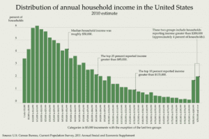
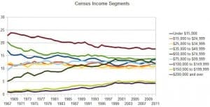
McArdle makes a good point: of course, if you spread the histogram along a uniform scale (or, for that matter, a log scale), you don’t see that bump at the high end. McArdle reproduces some Census charts showing income stability over the past few decades:
Before I had a chance to chance to write about this, I noticed that Mark Palko did the job for me. Palko writes:
To the extent that statistics includes data visualization, this is definitely bad statistics. When trying to depict trends and relationships, you generally want to get as much of the pertinent information as possible into the same graph. You don’t want to force the reader to jump around the page trying to estimate slopes and compare magnitudes, nor do you want to take a few snapshots when you can easily picture all the data.
I don’t think this should be taken as a criticism of McArdle—after all, she was moving the ball forward by presenting some relevant numbers.
Rather, Palko is raising a point—statistics is about comparison—which I think is so important and not well enough understood. It starts with intro stat textbooks that yammer on about the sampling distribution of the sample mean, then continues with more advanced books (including mine! sorry!) that are all about estimating “theta” without saying why anyone would want to do so. The econometricians are better in this respect in that they keep their eye on the ball of estimating causal effects, which are inherently comparisons.
When it comes to statistical graphics, the importance of comparisons was emphasized by Bill Cleveland in his classic book, The Elements of Graphing Data, as well as by Tukey. And I’ve argued for the connection between exploratory data analysis, statistical comparison, and Bayesian model checking, in an attempt to place the principles of statistical graphics in a larger theoretical framework. And then there’s Lee Wilkinson, Hadley Wickham, and others. So lots of people have been thinking about this, but it hasn’t been fully integrated into how people think about statistics more generally.
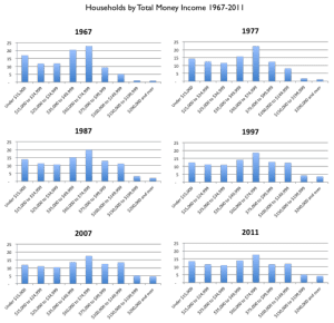
Anyway, Palko used the same Census data source as McArdle to make the following graphs:

Beyond all this, there’s the challenge of reconciling these income data with other things we’ve been hearing about economic trends. For example, I recently read somewhere that Americans are three times richer than they were a few decades ago. I can’t remember whether this was coming from a liberal saying why we can afford more social programs or a conservative who was saying that we should stop worrying about the poverty line, but in any case a quick web search indeed shows something like a doubling of inflation-adjusted GDP since 1970. So, from that perspective, a flattening of incomes doesn’t look so good. I guess a larger portion of Americans are in the labor force than were in 1970, also households are smaller than average. So a slight and steady decline on one scale (individual incomes) corresponds to a solid increase on another scale (per-capita GDP) and a decrease on another (share of income going to the middle class).
I’m not making any claims here. I’ll leave the macro to the Mankiws and Krugmans of the world. As a statistician and political scientist, it’s good to have the luxury to just explore and understand, rather than trying to feel the need to make some political point, whether it be that Americans are richer than ever or that we’re going to hell in a hand basket (or maybe both!).
P.S. Palko’s blog (with Joseph Delaney) has lots of good stuff. I hope that some people are reading it directly and not just looking at the entries that I occasionally link to.