


I saw this graph posted by Tyler Cowen:

and my first thought was that the bar plot should be replaced by a line plot: Six lines, one for each income category, with each line being a time series of these changes. With a line plot, you can more easily see each time series (these are hard to see in the barplot because you have to follow each color and jump from decade to decade) and also compare the patterns for each category. The line plot pretty much dominates the bar plot.
At least that was the theory. Now here’s what actually happened.
I downloaded the data as Excel files, saved them as csv, then read them into R. In all, it took close to an hour to get the data set up in the format that was needed to make the graphs. At this point it was pretty easy to make the line plot. But the result was disappointing:

The six lines are hard to untangle (sure, a better color scheme might help, but it wouldn’t really solve the problem) and the graph as a whole is much less clear than the original bar plot.
My next try was small multiples: six little graphs, each with its own time series. That didn’t work so well either (although, on the plus side, it only took a few minutes to make that graph).
Then I thought of plotting the incomes over time (all these income values are inflation-adjusted, of course):
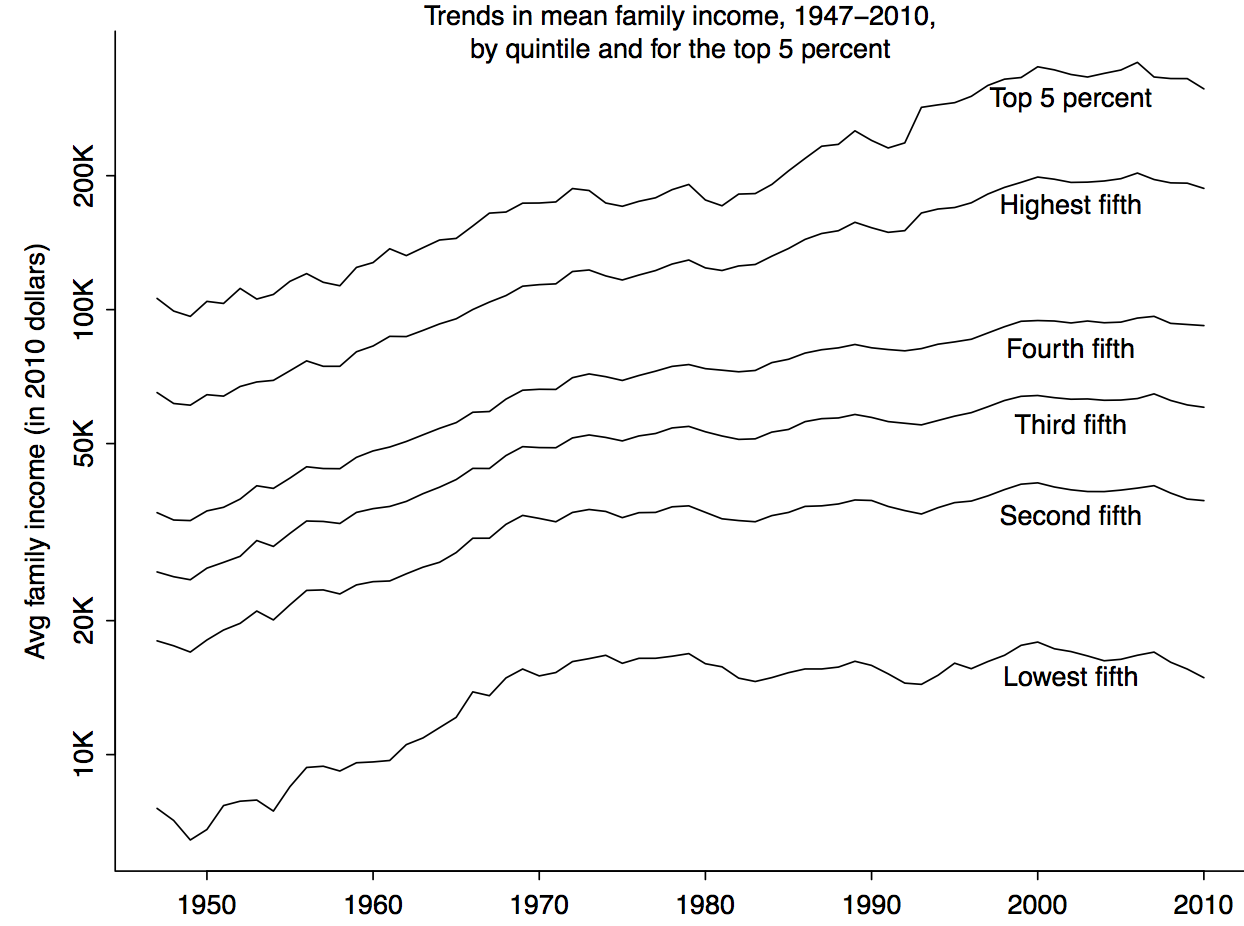
I like this one a lot. In particular, it shows that the drop from 2000-2010 is really a drop since 2007. (Although I suppose Cowen would argue that the drop was really happening earlier and it was just that the economy was doing a Wile E. Coyote, standing in midair and not actually going into freefall until people realized they had gone off the edge of the cliff).
Still, even the time-trends graph is not quite a replacement for the original bar plot which shows so much drama. I think my recommended solution is to give the bar plot for the initial impression and then follow up immediately with the time-trends graph, which shows the big picture much more clearly.