


In a discussion of workplace segregation, Philip Cohen posts some graphs that led me to a statistical question.
I’ll pose my question below, but first the graphs:
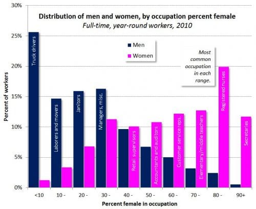
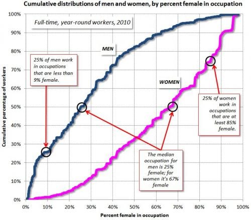
In a world of zero segregation of jobs by sex, the top graph above would have a spike at 50% (or, whatever the actual percentage is of women in the labor force) and, in the bottom graph, the pink and blue lines would be in the same place and would look like very steep S curves. The difference between the pink and blue lines represents segregation by job.
One thing I wonder is how these graphs would change if we redefine occupation. (For example, is my occupation “mathematical scientist,” “statistician,” “teacher,” “university professor,” “statistics professor,” or “tenured statistics professor”?) Finer or coarser classification would give different results, and I wonder how this would work.
This is not at all meant as a criticism of Cohen’s claims, it’s just a statistical question. I’m guessing that someone’s looked into this already and that there’s some research literature on the topic.